I love working with start-ups, because it’s the same feeling I get when I open a book for the very first time. A feeling of freshness and anticipation and excitement towards helping realize a brand into the vision it began with. And that’s what I got (and still get to do) with Ohai. When the folks at Cutting Chai Tech approached me with the branding assignment for Ohai, their flagship product, it was still in development. I was bowled over by the sheer energy of the team, and their passion towards their product. I LOVE it when a client of mine is super-excited about their brand, and super excited they were. Ready to answer questions (and I had a lot of them), on-point with feedback, and always up for chai are some of the qualities I Iove in my clients, and we had a ball designing the Ohai brand.
Here’s how Anand, CEO and co-founder of Cutting Chai Tech described Ohai to me – Ohai is a professional networking app, with an edge. With Ohai you can connect with like-minded, relevant people who are in close physical proximity, which means you can send someone a “meet request” and meet them right away. Ohai will also intimate you when you have a potential “match” around you, based on your profile and interests. Now, how cool is that?
Because Ohai is a social networking app, we decided the logo needed to be something that was simple, friendly, and memorable. And because the TG was mostly young professionals, we decided the brand should feel light, minimal and fresh. Here’s the inspiration board I came up with to reflect these qualities –

Once we locked in on the imagery, I set upon creating concepts for them to choose from. I liked the idea of making the logo a wordplay on the name Ohai – a friendly “Hi”, since the purpose of Ohai is connecting professionals, and it all starts with a Hi. And since Ohai was a networking app that helped professionals discover each other, I wanted the logo to touch on that as well. Anand loved it too, and we set about tweaking and refining the logo till it was perfect, and the Ohai logo was born.
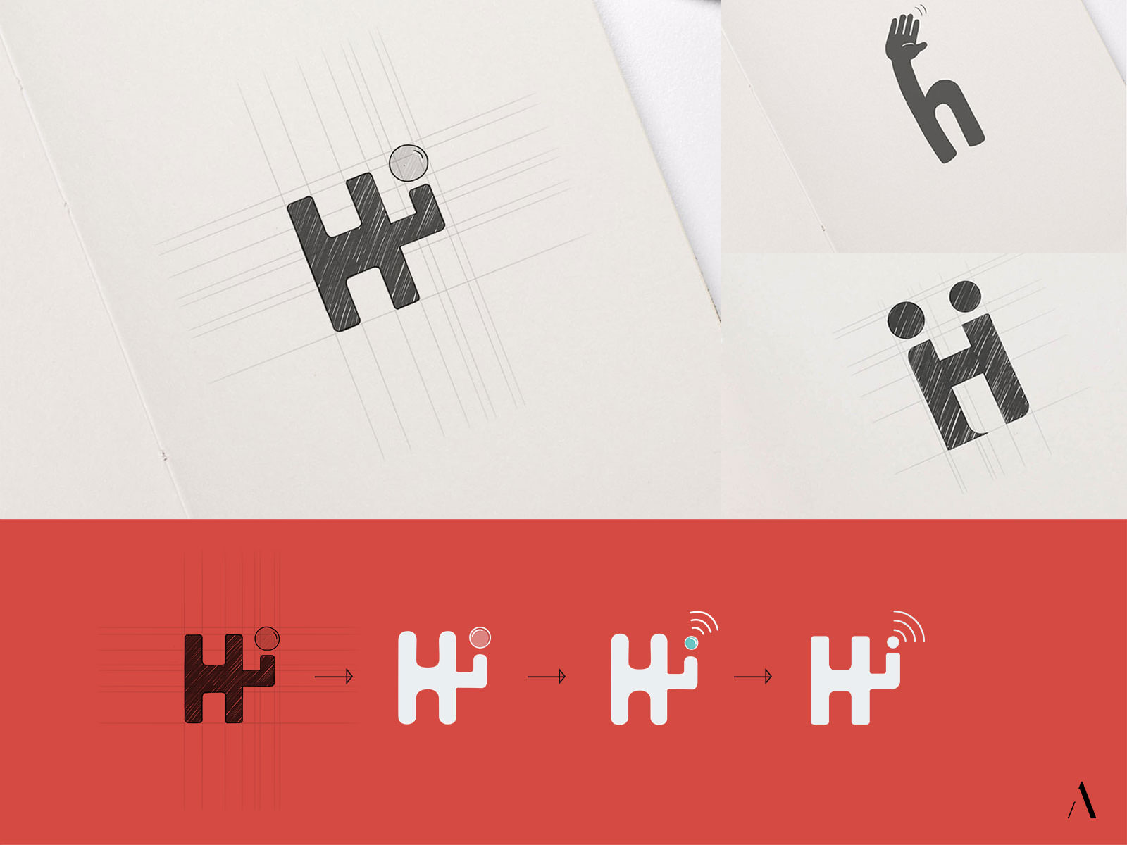
They also needed a logotype, so we picked a typeface that would go well with the logo. The main brand color, a pleasant red represents the energy and drive of the Ohai team and their TG. For the secondary colors, we wanted colors that represent the fun and fresh, yet professional nature of the app. We wanted blues, but not the typical blues, and went with some offbeat colors that work well the app interface. Here’s how the final logo and brand style board looks

Then came the marketing collateral for immediate use – business cards, tee-shirts, flyers, the works. Here’s some of the early brand collateral. As the brand and product evolved, a lot more was added to this set (and will continue to be) which I’ll be sharing with you guys in future updates.
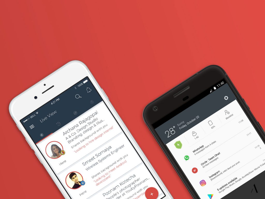
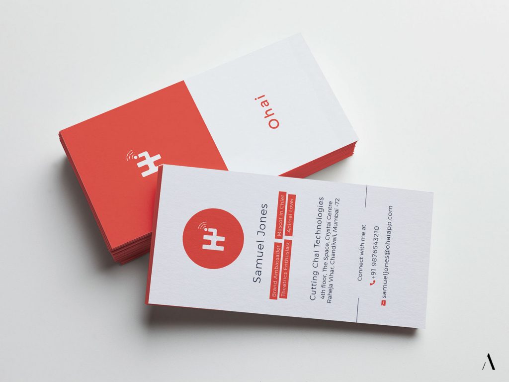
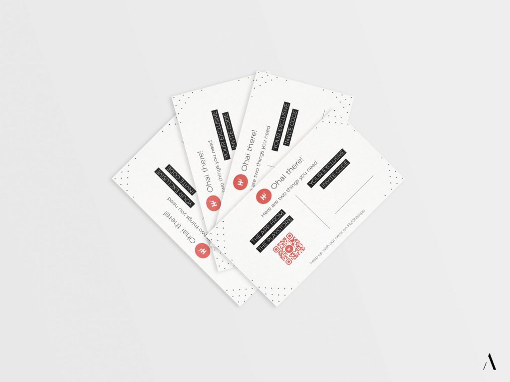

CCT/ Ohai is of my favorite clients, and it’s been amazing being a part of their journey as they develop a product that aims to redefine networking. More than anything, I love the way they’re always enthusiastically at work, building and improving their product and user experience. You can check them out here, to learn more about the app and how it works.
We’d love to hear what you think about this project, so share your thoughts with us in comments below.
Cheers!


Leave a Comment
Your email address will not be published. Required fields marked *