Hi! Welcome to the section on my blog, where every week, I post curated stuff that makes my eyes light up, and am sure, will evoke the same reaction from you all. And we’ll not call it a listicle. The first post, in true graphic designer fashion, is going to be about fonts, or rather, typefaces.
I am kind of a lowkey font nerd – I get excited about fonts and typography, and yes, it is now the first thing I notice when I get my hands on any written material, from a random flyer to a restaurant menu or a website, but having discovered fonts only after the advent of computers, I don’t particularly mind the terms ‘font’ and ‘typeface’ being used interchangeably (There IS however a difference – A typeface is the font family, whereas the font is an individual style from the family) Here’s the long version, for the hardcore font nerds.
Although I’ve recently come to love serif fonts, sans serif is where my love for fonts began. So here’s a list of my current favorite 7 free typefaces, which means you can go ahead and use them for your projects without burning a hole in your wallet (but hey, those paid fonts are totally worth it too). I’ll make a list of the paid ones too, because there are some(understatement!) that make me drool. Most of these come in multiple weights, and while they’re all good, I do have some favorite “fonts”. Here they are –
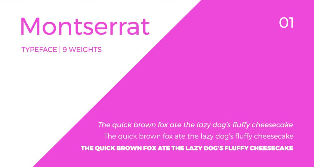
I absolutely LOVE this font. It’s one of those fonts that can make anything look good, and one of my all-time favorites. I especially like the roundness of it, which gives it a friendly look. It works beautifully for posters and reads well for paragraphs as well. The typeface is available in 9 weights, ranging from Ultra thin / Hairline to Black, and although all of them are beautiful, Montseratt Light is my absolute favorite. It’s light, crisp, and frankly, quite yummy.
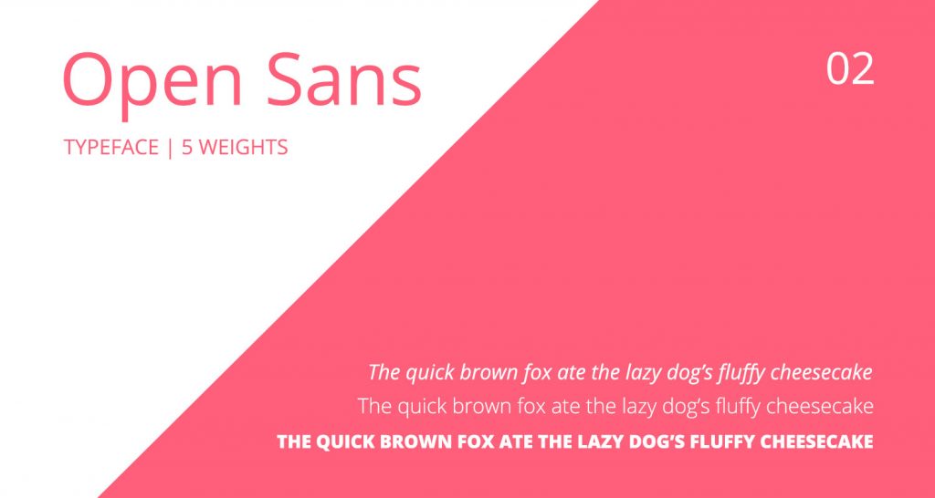
A widely used font for many a website, Open sans is the almost the first font that comes to mind when someone says open source, sans serif. Clean, functional and with multiple weight options, Open Sans is perfect to use for apps, websites and presentations alike. It’s not very round, making it great for projects which require formal typography. Open Sans comes in 5 weights, and my personal favorite is Open Sans Light, which isn’t too thin or thick, and looks especially good in caps.

Another popular font on the web, and for good reason. Lato as a typeface is quite unassuming, especially in smaller sizes. The distinctive features of the typeface only come into focus in larger sizes. An interesting thing I found with this typeface is the inversion of the “g” in its italic styles. Something I’ll look into and look for in all typefaces now. Lato is a typeface that was originally created for a corporate project, and although the original client decided not to go ahead with Lato, it actually works quite well for corporate projects. Lato comes in 9 weights, from Hairline to Black, Lato Bold being my favorite. One thing I kinda don’t like about Lato is the way the ‘f’ joins some alphabets in some cases, like in the words ‘fluffy’ above.
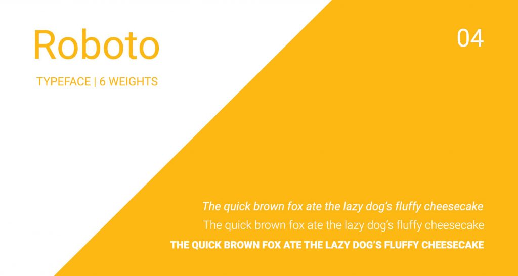
You know a font is good when Google uses it. Used widely as an android standard typeface, Roboto does really look good on mobile devices. It’s un-intrusive and clean, which makes it great for readability, especially for copy-intensive projects. It comes in 5 weights ranging from thin to black, making for a lot of variety. Favorite Roboto weights – Thin and Black.
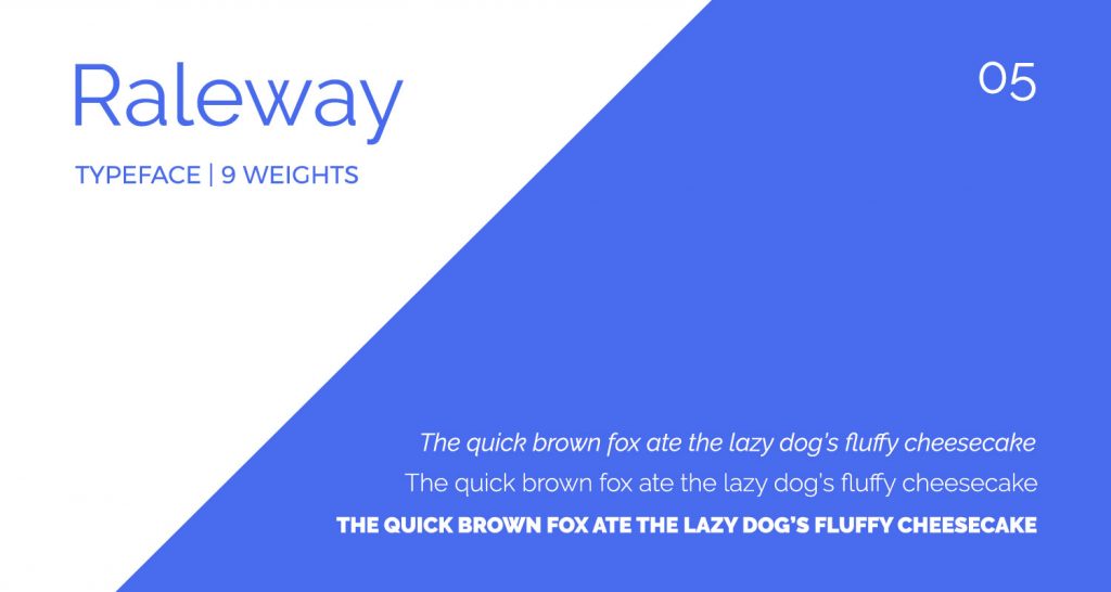
Another all-time favorite, as well as one of my brand fonts, Raleway is one of the most elegant sans serif fonts ever – just look at the W! Although originally intended for use in larger sizes, I quite like how Raleway looks in smaller sizes too. It’s quite a popular choice on websites., and for good reason. Raleway has a nice range of weights from Thin to Black, and looks good in all of those. Favorite Raleway weights – Extralight and Regular; the Extralight looks really good on screen, white the Regular weight prints quite well.
6. Avenir
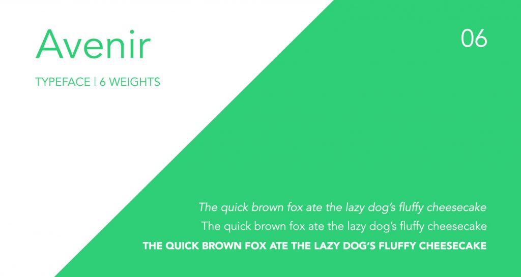
This is one I fell in love with after I got my MacBook Pro, as it’s in-built with the Mac. With 6 weights to choose from, it’s great for any project which needs sleek, elegant typography. I especially love the lower case alphabets in Avenir. They don’t have any weird shapes, and read well in paragraphs. Again, I like the slight roundness of the alphabets in this typeface. My favorites are Avenir Medium and Avenir Light. Disclaimer for this beauty – It comes bundled with a Mac, so it’s free to use for Mac users, but is unfortunately, a paid font for Windows users.
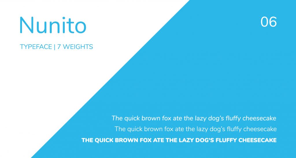
Similar to Avenir, but with rounded corners, Nunito would be a great alternative for Windows folks who love Avenir. It’s sleek and elegant, and would work well for paragraphs. I’m personally not the biggest fan of using round edged fonts for headlines, but for paragraphs and small sizes, Nunito definitely works. Nunito comes in 7 weights, ranging from Extra light to Black, Extra light being my favorite.
What are some of your favorite Sans serif fonts? Tell me in comments below and let’s talk fonts.


Leave a Comment
Your email address will not be published. Required fields marked *