

One of my foremost clients, Cutting Chai Technologies, or CCT for short, reached out for a rebrand of their visual identity. We’ve been working with the CCT team for a long time now, since they first started working on their product Ohai. The CCT mantra is ‘Reimagining the Web’, and they work on products that leverage wireless technologies in ways to reimagine how people, businesses, and places connect with each other in physical spaces.
I remember walking into their office the first time, and discussing their rebranding. While they did agree that the visual identity for the company required to be redone, the focus at the time was on building their product Ohai and working on its visual identity, so design efforts for CCT took a back seat.
Fast forward 3 years, the CCT team is now busy working hard on its second awesome product ‘Inventa’, a platform to provide high impact Online-to-Offline (O2O) experiences for Consumer Apps. Inventa again, is an A&Co identity design project.
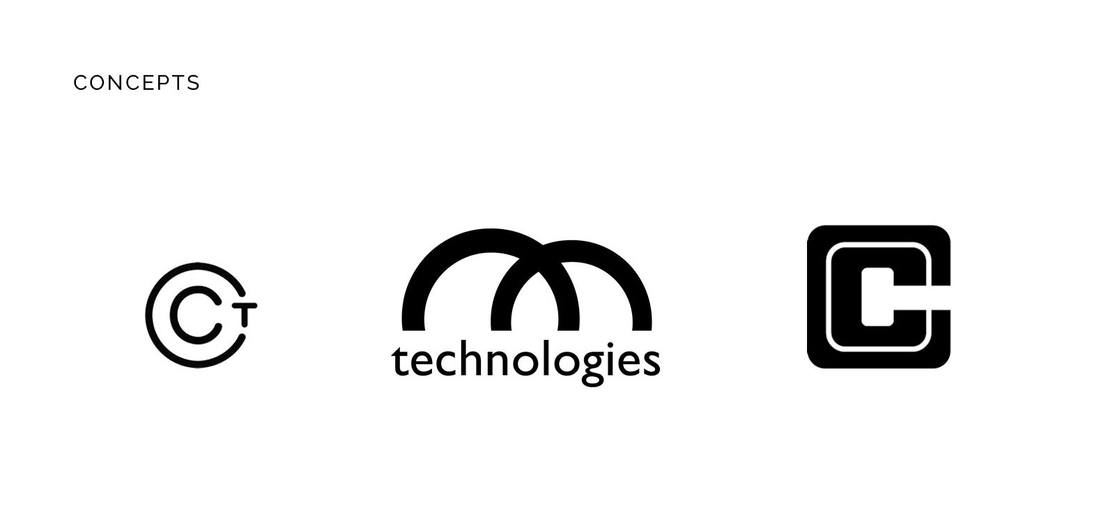
As CCT matured, the visual identity for the company itself became important as well – the team was growing, and so were the stakeholders. Crafting a visual identity for CCT was now a priority. Having worked with them since their Ohai days, the CCT story and ideals were clear to us. Cutting Chai Tech is a team of young and vibrant deep-tech experts in the business of providing innovative solutions through their products. We knew what needed to be done. Their old, quickly put-together logo had to go, and an identity system needed to be established, one that communicated the CCT story and values clearly –
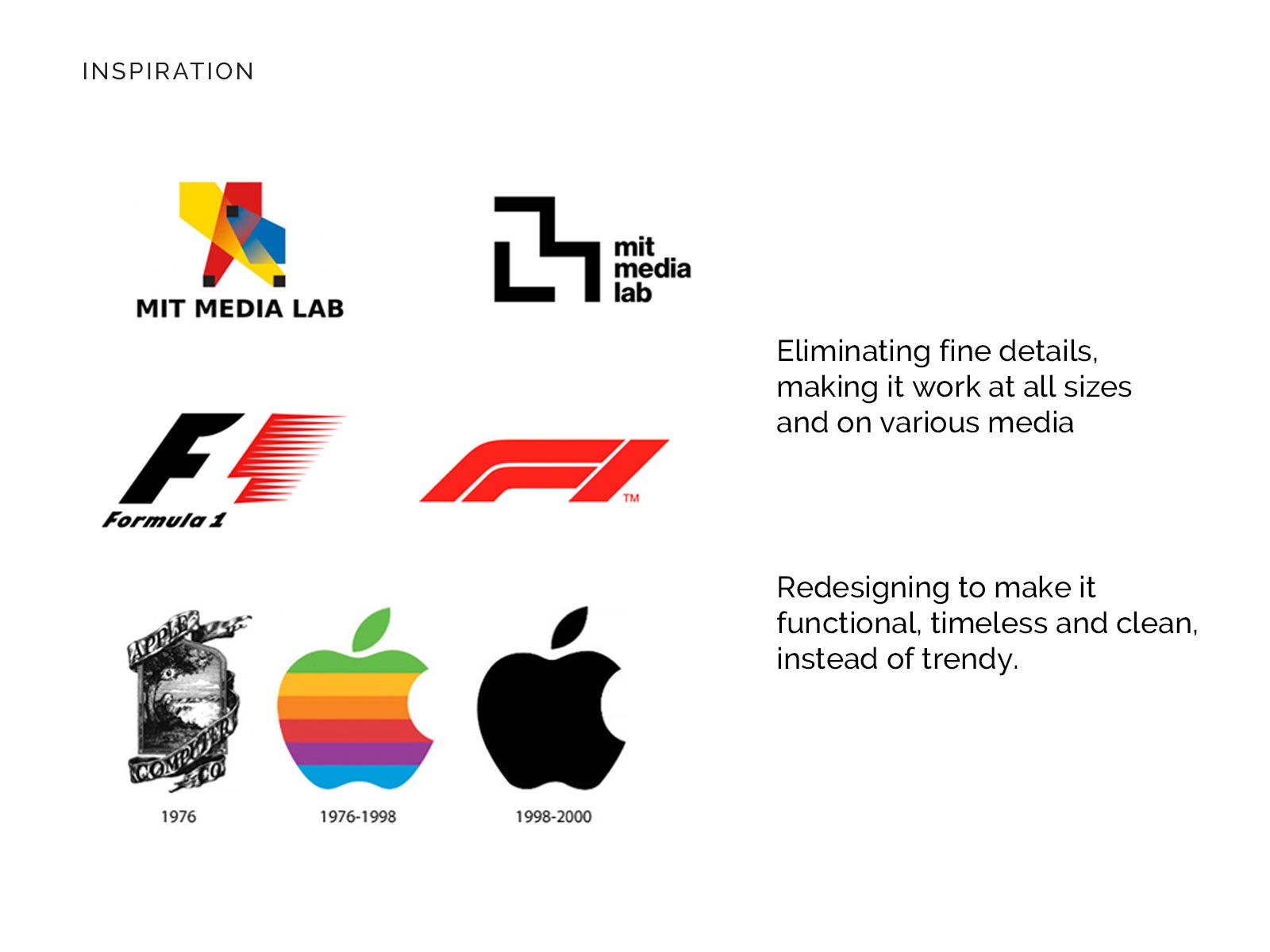
We defined the rebranding goals, and what we set out to design an identity that was minimal, timeless and professional, while still communicating the energy and vibe of CCT.
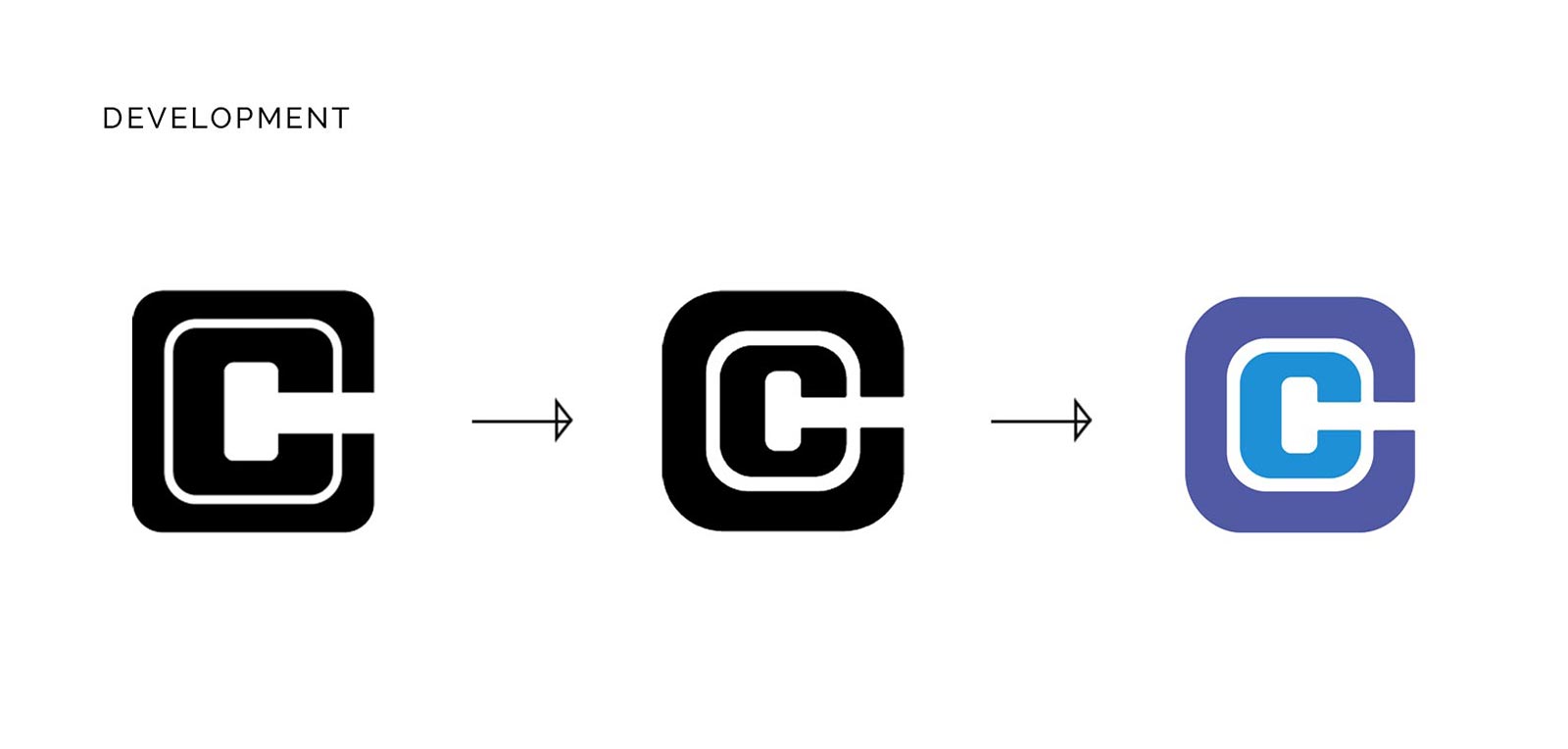
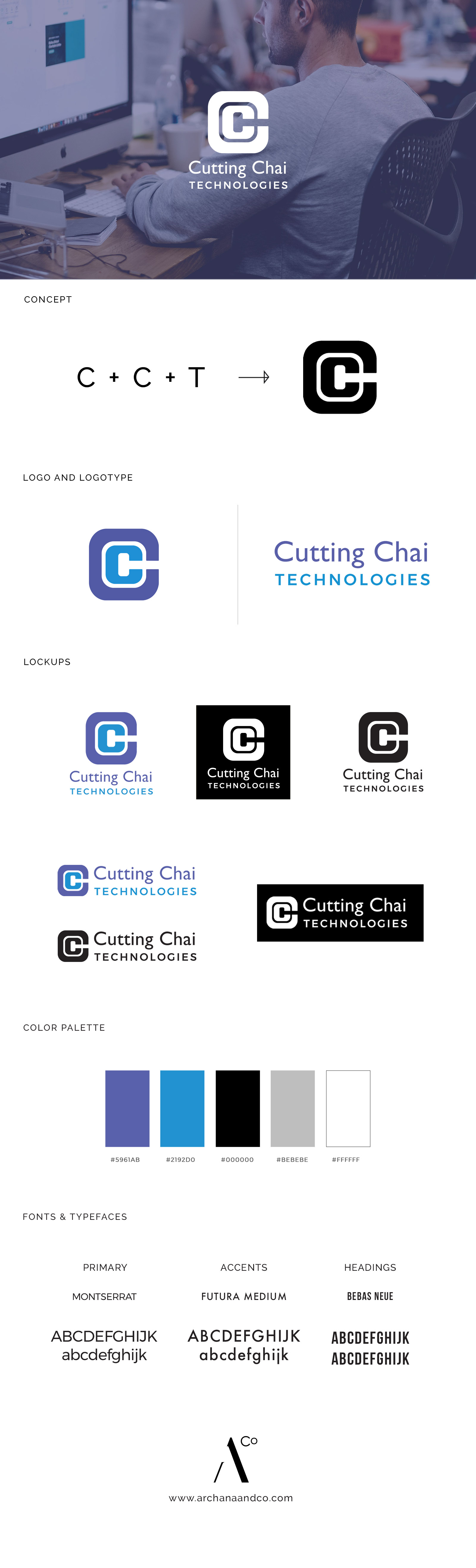
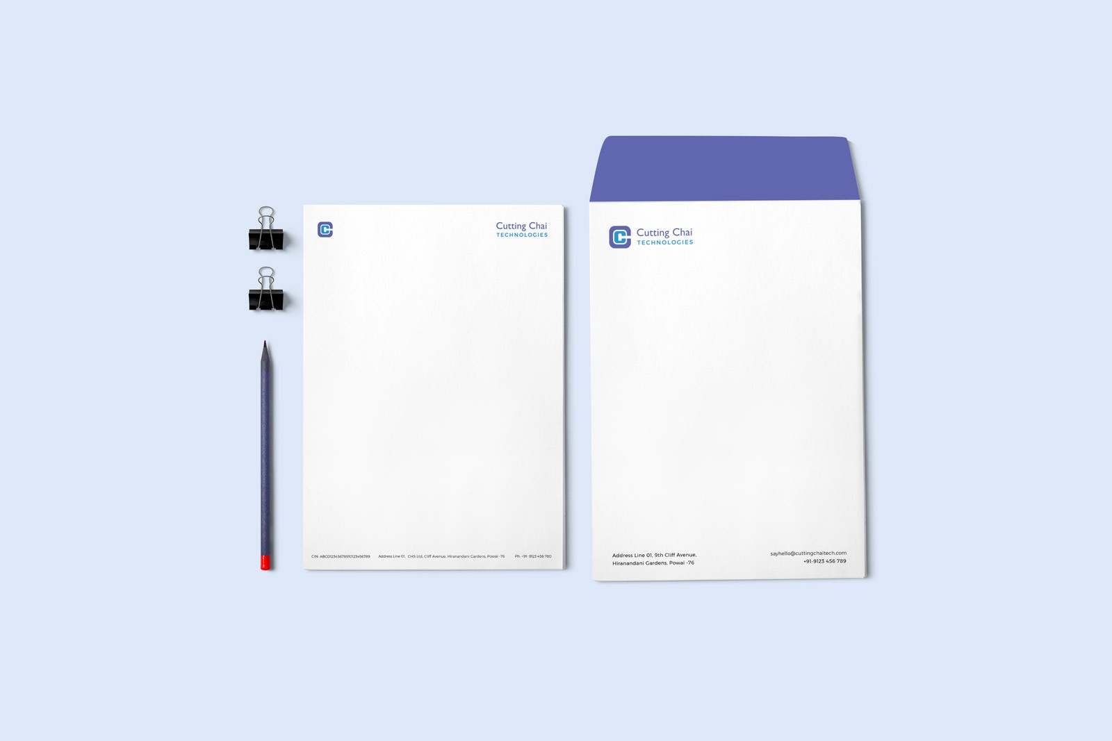
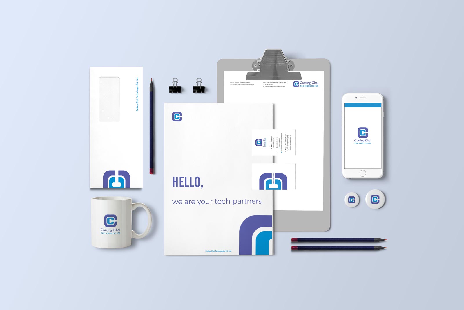
The logo was completely redesigned, the newer one being a minimalist, clean monogram reading CCT. It is suitable to be used in the corporate scenario, and is functional at all sizes. The new brand colors were chosen keeping in mind the young energy as well as deep tech expertise that is an integral part of the Cutting Chai Tech culture.
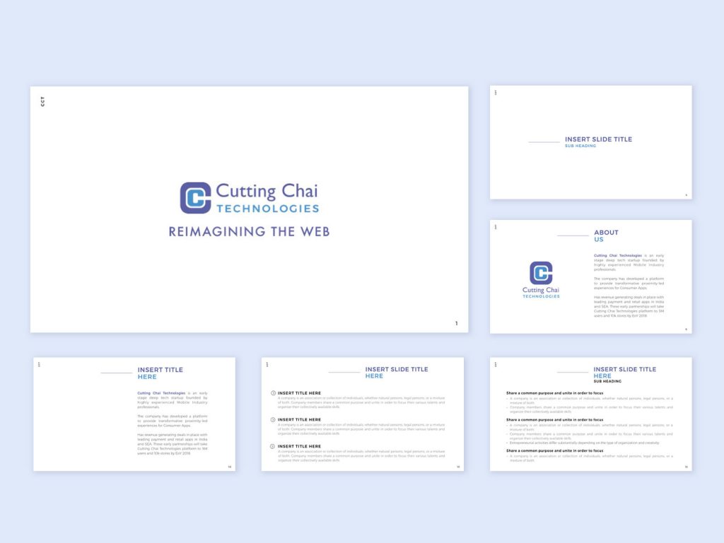
Here’s the final brand board for Cutting Chai Technologies, with its new logo, color palette , and brand fonts and typefaces. The typefaces chosen for the rebranded CCT are clean serif fonts, to characterize the modern, light look. Montserrat, chosen as the primary font, communicates the typical, welcoming, friendly tone of CCT, and it doubles up as a link of consistency between CCT and its products Ohai and Inventa, both of which also share this primary font.
The visual language for the brand is one that conveys precisely what it needs to, with minimal use of design elements.
Being a young, growing company, there is a lot of outward facing communication at CCT. Naturally, the new identity system had to be one that helped CCT put their best foot forward on all fronts.
Along with physical channels of communication, being a growing company means frequent conversations with investors and stakeholders as well as internal communication. So we crafted a presentation template for CCT, that helped them save time while sharing know-how and also ensured that all communication, be it a pitch deck or an internal presentation, is always on-point.

3 years down the line, it’s still great working with these guys. By the way, we’re also doing something super interesting for their office space. Wait for it!

Leave a Comment
Your email address will not be published. Required fields marked *