

Fitness isn’t something that we always take seriously, and I personally never been a gym person either. To be honest, the thought of gym machinery really just puts me off. But as it turns out, branding is one reason I’d totally go to the gym for. Since we didn’t actually need to work out at this gym, when we started working with the folks behind M5 fitness, it was super interesting knowing every little thing from how they were planning to run it, the machinery they would be procuring, the trainers they’d be hiring, and of course, what their brand vision was.
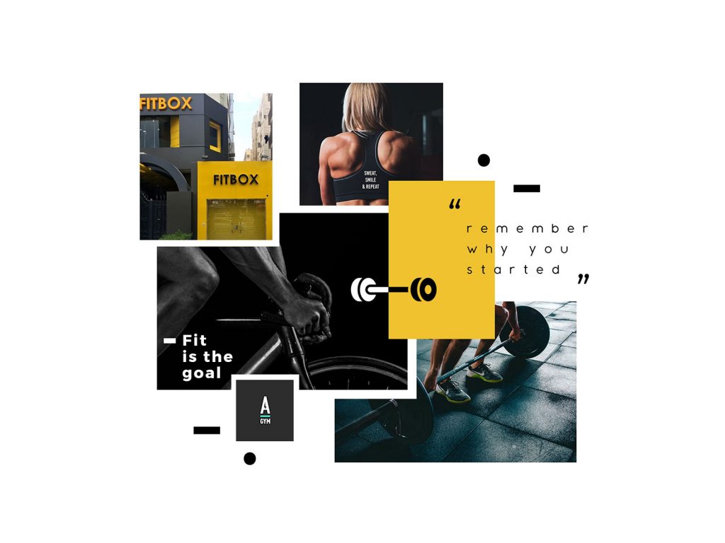
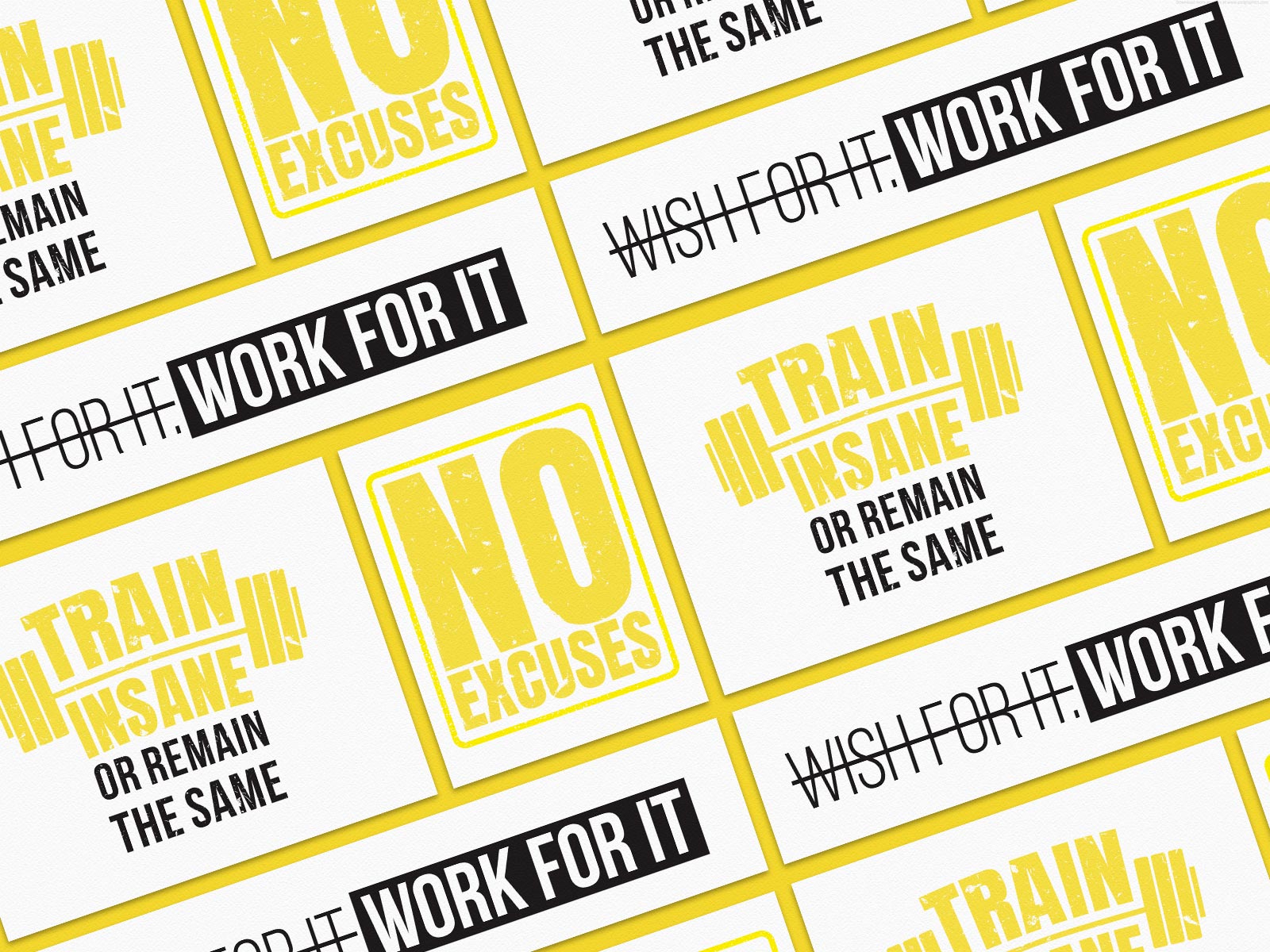
The vision behind M5 fitness, is simple – “Fit” isn’t a destination, but a way of life”, and beautiful. “Fit” also means different things to different people., though, so here’s the inspiration board we came up with, for M5 –
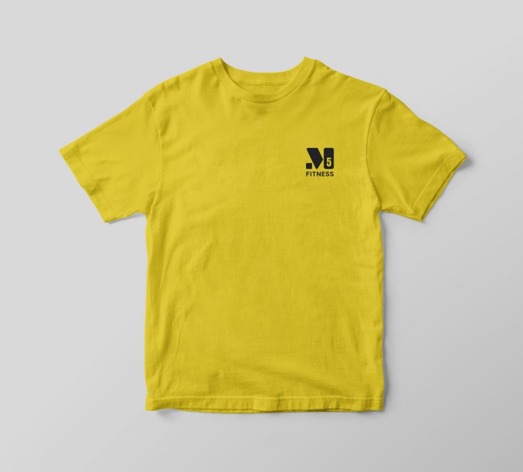
Working on a fitness brand was a first for us, but we thoroughly enjoyed it. As we set about drafting concepts for the M5 logo, we decided to keep away from the usual barbells and weights imagery, which, although recognizable, felt quite repetitive. So we explored a subtle approach to represent fitness instead – blocks. Meant to signify the support that M5 offered its members on their fitness journey, we tinkered around with the concept to come up with a minimalist icon which captured this vibe.
And here’s the result –
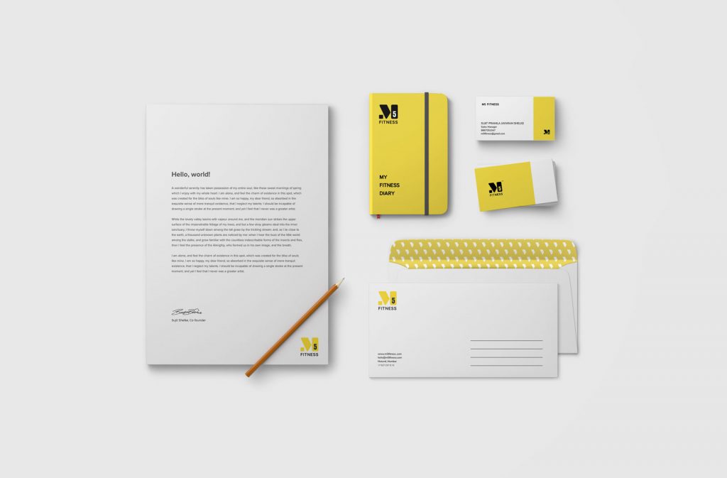
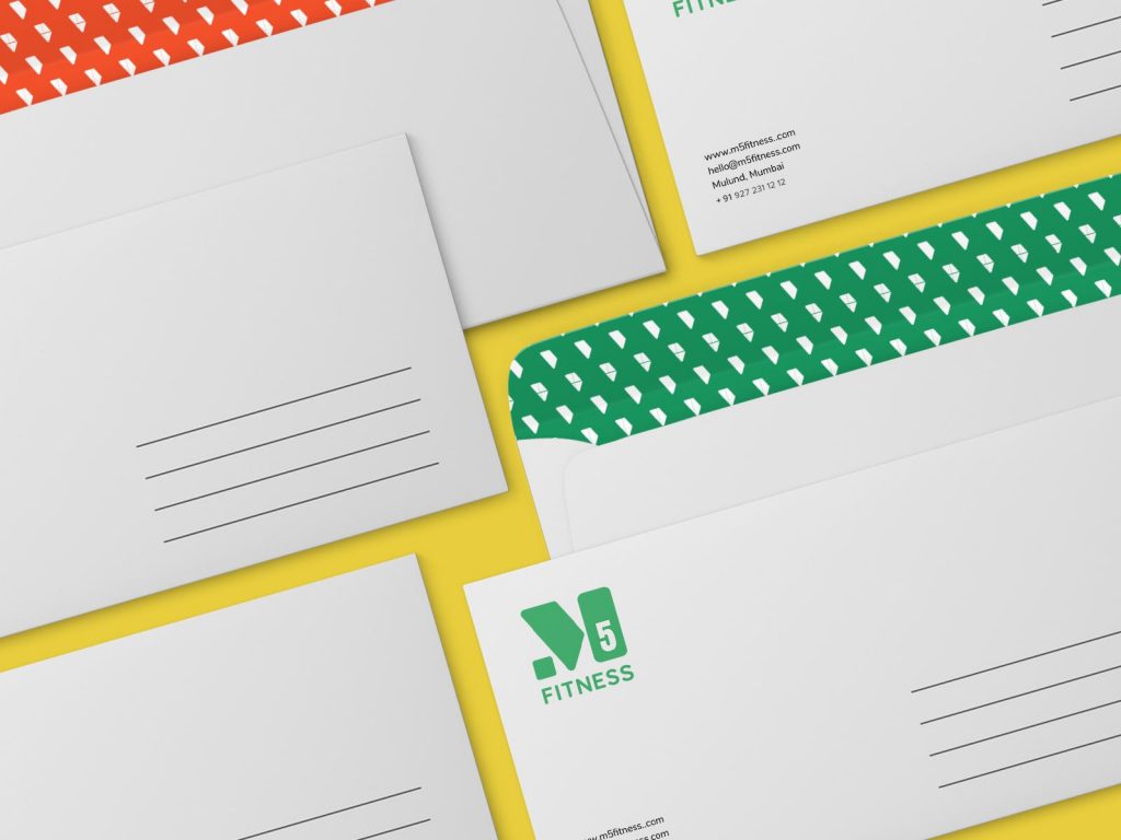
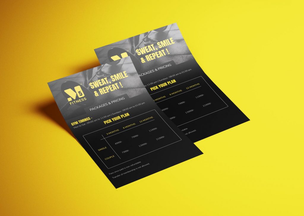
Next up was a lot of work, from creating a multilingual, yet aesthetically pleasing shop hoarding, to the posters for the interiors, as well as flyers, business cards, etc.

As we started working on this assignment, I realised, gyms aren’t so bad afterall. And although I still stay away from machine training, I did become a fitness person. I took up yoga 🙂 Let me know what you think of the M5 fitness branding in comments below!

Leave a Comment
Your email address will not be published. Required fields marked *