

So I absolutely love working on branding assignments. And illustrations are my not-so-secret love. And sometimes, illustration and branding go really great together. So any time I see a brand put illustrations to work for their brand, and do it well, I fall in love with them. Here are a few such brands, who regularly use illustrations, and how –
1. Dropbox
Of course I had to start with this brand, because the very first time I laid my eyes on the Dropbox illustrations, I was struck by cupid’s arrow. I’m talking, of course, about the current style of Dropbox illustrations with the minimalist, blob-like characters. Dropbox has been using illustrations since way back, but this new style is their best one yet. What I love about these illustrations is the fact that the characters are not human, and yet can showcase a myriad of human needs and use-cases without needing to worry about being inclusive or politically correct. Kinda like stick figures, but more cuddly, and dare I say, way more fun? Each of the illustrations is also backed by a strong, conceptual link that highlights a feature or benefit of dropbox. Dropbox using this style proves once again, that the best things are often simple.
Check out some of my favorite Dropbox illustrations below.


If you’re like me and would like to read about how they went about developing this style, check out this incredibly interesting two-part article by Michael Jeter, the Illustration lead at Dropbox – Part 1 and Part 2
I’m also a sucker for brilliant 404 messages, and Dropbox makes that list too.
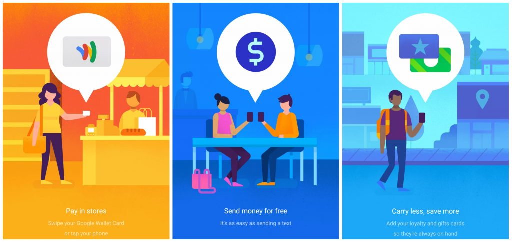
2. Google product illustrations
Think ‘brand illustrations’ and Google is probably the first thing that comes to mind. With hundreds of Google Doodles for almost every event there is, it’s only natural. Google has always used illustrations and fun imagery to get their message out, but there was little consistency between its several offerings. The recent refresh fixed that and how! The new illustrations and animations used by Google across their multitude of apps and services are much like the rest of Google – colorful, playful, useful, and in-line with material design. Being a fan of flat-vector style illustration, I absolutely adore this style. It’s just like Google to keep things playfully gorgeous. I love the slightly textured feel to them, making them more organic, and very Google-like. And speaking of consistency, I love how this style is used in a lot of daily Google Doodles as well. Adds great brand recall value! And needless to say, they’re all beautifully animated. Here are some of my personal favorites from the Google brand illustrations.

 ‘
‘

If you’re looking for a more thorough read on when and how Google decided to up their illustration game, here’s a link.
3. Air Bnb
In total contrast to the minimalist dropbox illustrations, Airbnb is nothing if not extra. And gorgeously so. Their brand illustrations are an explosion of colors and shapes that perfectly for the brand. Normally, I’m all for consistency in style, because it adds to brand recall value, but Airbnb gets away with multiple styles because they’re all conceptually strong conveying the What’s What and What’s Cool about Airbnb. I especially love their “how it works” illustration. The copy and panels perfectly capture the gist of how Airbnb works, and the style is cool too, although I’d have liked it a little more if it included the Airbnb logo somewhere in step 2. Nevertheless, all of the Airbnb illustrations serve their purpose while also being a visual treat, so check out my favorites down below and be on the lookout for more as you explore Airbnb.


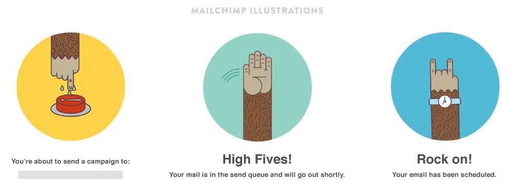
4. Mailchimp
Now here’s another brand that uses illustrations well – Mailchimp. For starters, they have an illustrated chimp in their logo. Did you know he has a name? It’s Freddie, short for Frederick von Chimpenheimer IV. Cute, eh? Now, Mailchimp is a double-win-brand in my opinion, because not only does it use illustrations well in its campaigns and on the website, but also mixes it up by adding other elements, such as design and photography, making its branding approach unique and fresh. With a blend of vibrant colors and simple patterns and elements, Mailchimp aces the design game. And of course, everybody loves the chimpy hi-fives and hand gestures that inform us of actions taken. So that’s an illustration win as well. If there’s one thing I’d change about Mailchimp, it would be to update the chimp-logo so it’s more in-line with the other illustrations. As I researched the company for this article, I found out that the company has serious brand game, and am definitely writing an article on how they’re rocking that game. Until I do, check out their instagram account. I love how fun it is, and how it regularly features their Freddie in such interesting ways. They even have an array of Freddie figurines! How cool is that?

5. Cutting Chai Technologies
Seeing as I love these brands’ branding efforts, I jumped at the chance to use illustrations for a brand. I loved that one of my early clients, Cutting Chai Technologies, was totally game to using illustrations, both, to talk about the features of their flagship product Ohai, as well as to talk about its other offerings. Ohai is a young, fresh app with a unique value proposition. So going with illustrations to support their branding efforts made sense. After some exploration we settled on a human mascot. Thus, Samuel Jones was born, representing the young professionals that was their primary TG when Ohai first launched. We’ve since used Samuel Jones in multiple app-feature and social media illustrations, as well as in mailers and promotional material. Check out the many hats Samuel wears as he goes about explaining the What’s What(s) of Ohai, and tell me what you think of him, and of Ohai.


In recent years, illustration has become an integral part of brand development. Creative illustration will grab the consumer’s attention and direct their eyes to the information or details they need. If you want an illustration that communicates well with consumers, then contact the team of professional designers from Gapsy Studio.
More details here: https://gapsystudio.com/services/graphic-design/
Agreed, kate! illustration is one of the best ways to delight your customers while informing them of your value proposition.
Great article! the illustrations are very useful. it gives designer more ideas to be very creative in a way consumers/customers will patronize. you may try to visit https://a2designlab.com/ as well, a manila based design firm that offers all design needs and insights about branding and identity.
Thanks! I’m glad you found the post useful.
Hey, great piece. I love love love a brand that uses illustration well (being an illustrator myself) and this is a great list and resource to send any brands thinking about incorporating illustration. There’s nothing I love more as an illustrator than working on a consistent basis with a company that values artwork. it allows the work to mature into its own world and makes the business of illustration more relationship-centric and less a transactional.
I like your work! Keep it up. Ohai looks good!
– Steven Twigg
Thanks Steven 🙂 Glad you found this useful. And yes, illustrations are LOVE!
Leave a Comment
Your email address will not be published. Required fields marked *