

I think it’s safe to say that this has been the most exciting brand name I’ve worked with yet. On our first conversation about the brand, it was the brand name more than anything that drew me in. As soon as I heard the name ‘Pagal Awwrat’, I knew I wanted to work on this brand, and help shape it. And so I did.
Discovery sessions for Pagal Awwrat were exciting – we got clear on what Pagal Awwrat meant, what it stood for, what it aspired to be as a brand, and what it definitely wasn’t. We defined who Pagal Awwrat was for, who its ideal customer was, and what Pagal Awwrat would do for its customers, and how we could communicate this to them.
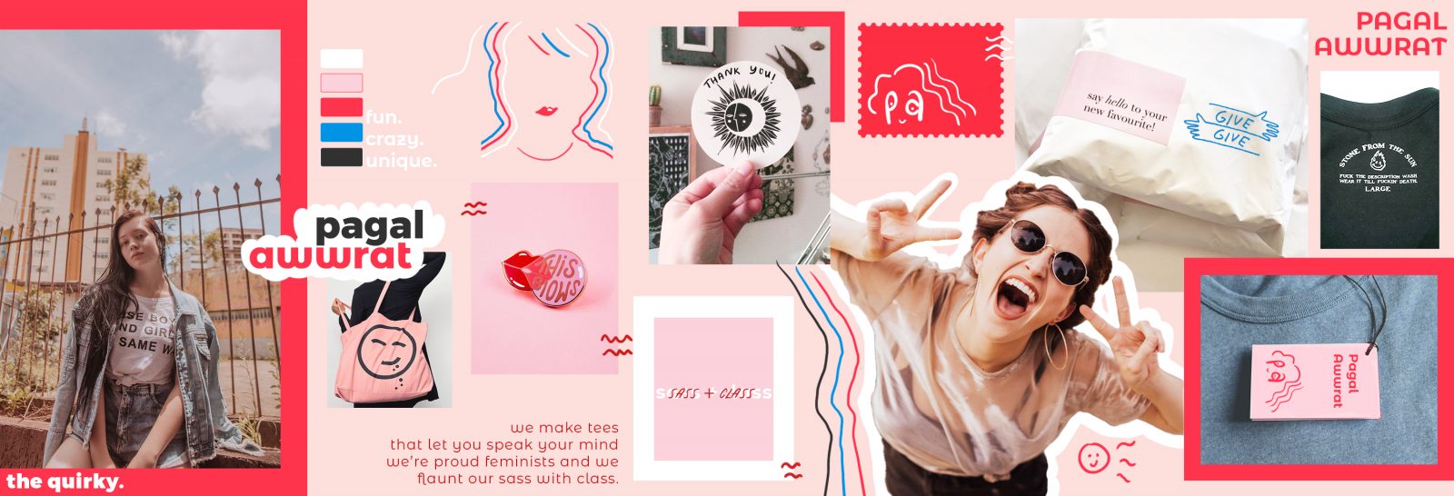
Here’s what we came up with – Pagal Awwrat is a T-shirt brand, that caters to women who like to wear what they feel. It’s a brand that celebrates every woman for who she is and what she identifies as being – strong, independent, bold, shy, sensitive, energetic, crazy or laid back. Pagal Awwrat seeks to help women own their vibe. They make cool, comfortable graphic T-shirts that women can wear as they conquer the world or lounge on their sofa ( or both 😉 ). Their designs are a blend of wit, desi-ness (Indian-ness), cheek, and humor. They have a lighthearted take on everyday things that are important to women, whether it’s their need for space, love for their pets, social distancing, or digs at stupid societal expectations.
With this understanding in mind, A&Co put together stylescapes to help translate this into visuals that helped set a course for the brand’s identity design system.


Once we were clear on the brand goals and values with stylescapes, we further solidified this understanding, and chose a design direction and tone of voice. We then explored some options for the Pagal Awwrat logo and set guidelines for the brand’s tone of voice, and approach to communication across various touch points.
We decided on a logo that was a visual play on the brand name, formed using its initials (P A), and that reflected the brand personality. ‘Sass with class’ being the personality archetype, the logo is playful, fun, as well as minimal. To compliment the hand drawn logo mark, we decided on a clean sanserif logotype that reinforces the minimalist, classy vibe, while ensuring it still conveys a welcoming personality with its rounded shape.
The color palette was also similarly chosen to be bold yet feminine, with a bright red, a subtle peach-pink, clean white and a balancing charcoal. For web-use, we added a balancing blue to the mix.
We also made a fun gif with the logo that captures the range of customers and personalities the brand caters to –
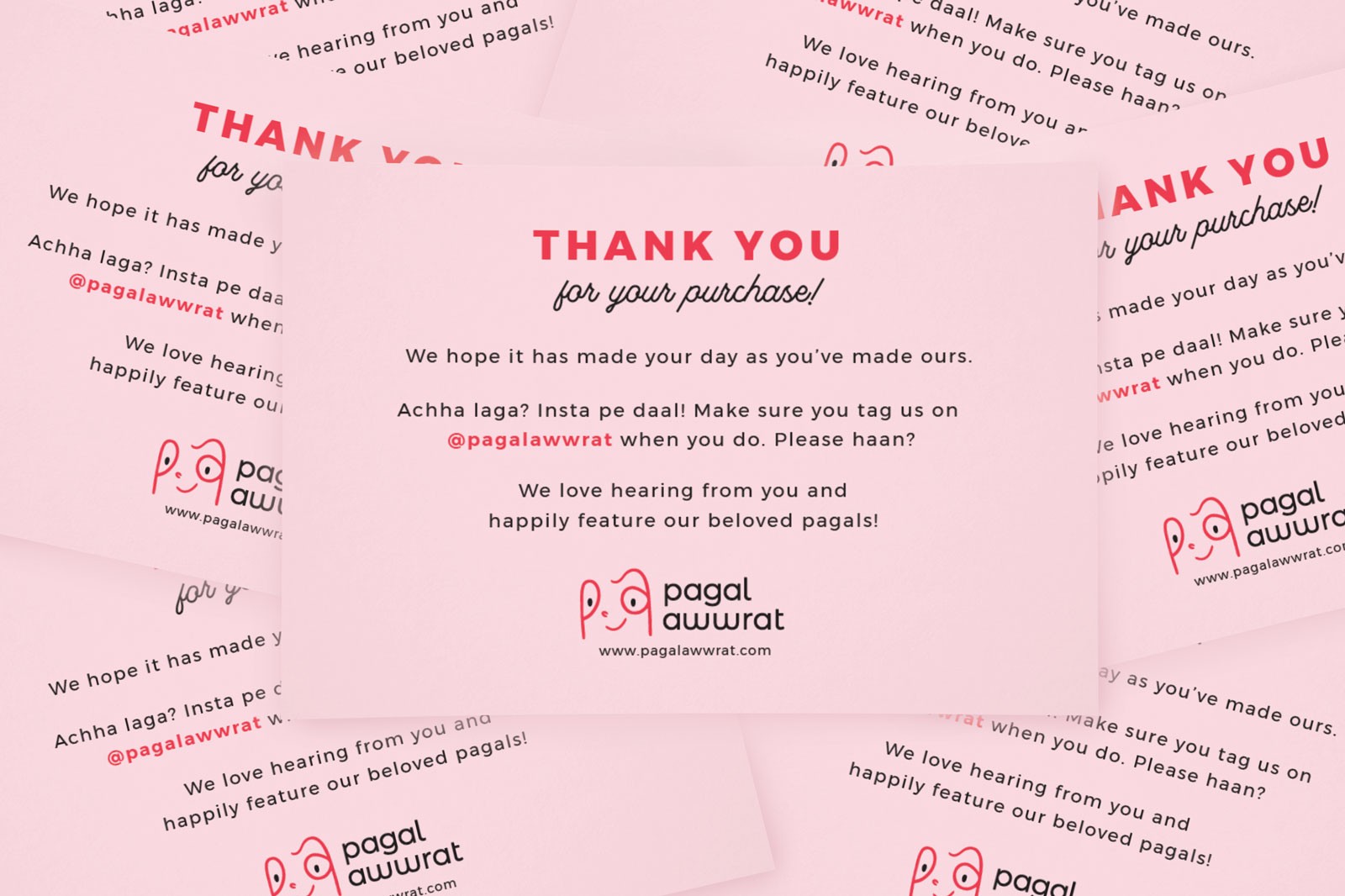
Once the primary brand assets were done, we set about making brand collateral that communicated with the customer at every touch point, from the packaging and thank you cards, to the washing instructions on the tee. The goal was to forge a bond with the customer by speaking their language, so all the brand collateral have dialogues directed at the customer. The design style is clean, minimalist, and typographic, which truly lets the conversation take centre stage.
The communication strategy for Pagal Awwrat was to keep things lighthearted and fun. Depending on the situation, “Pagal” can be taken to mean “crazy for or about” or just plain crazy / goofy, and is widely used casually as well as affectionately between friends. And yet, there were concerns that the brand name could be misinterpreted. Hence we set about normalizing the use of this word as a brand, and engaging in friendly conversation with the customer. The line are thus in Hinglish ( a mix of Hindi and English ). We had a ball of a time coming up with these lines for the brand collateral.


The goal with Pagal Awwrat was to build an identity system that is young, fresh and communicative, in line with the brand values. To that end, we did a good job, and customers have been very receptive to the brand.
I also ended up designing some of the tees themselves, as I became all the more involved with the brand ( more on this later ). Here are a few Pagal Awwrat T-shirt designs by yours truly.


These and many more are available to buy on the Pagal Awwrat website. I’ve hoarded quite a few myself and love how comfortable and fun they are. Feel free to check them out do let us know how you like them 🙂
Like this project?

Leave a Comment
Your email address will not be published. Required fields marked *